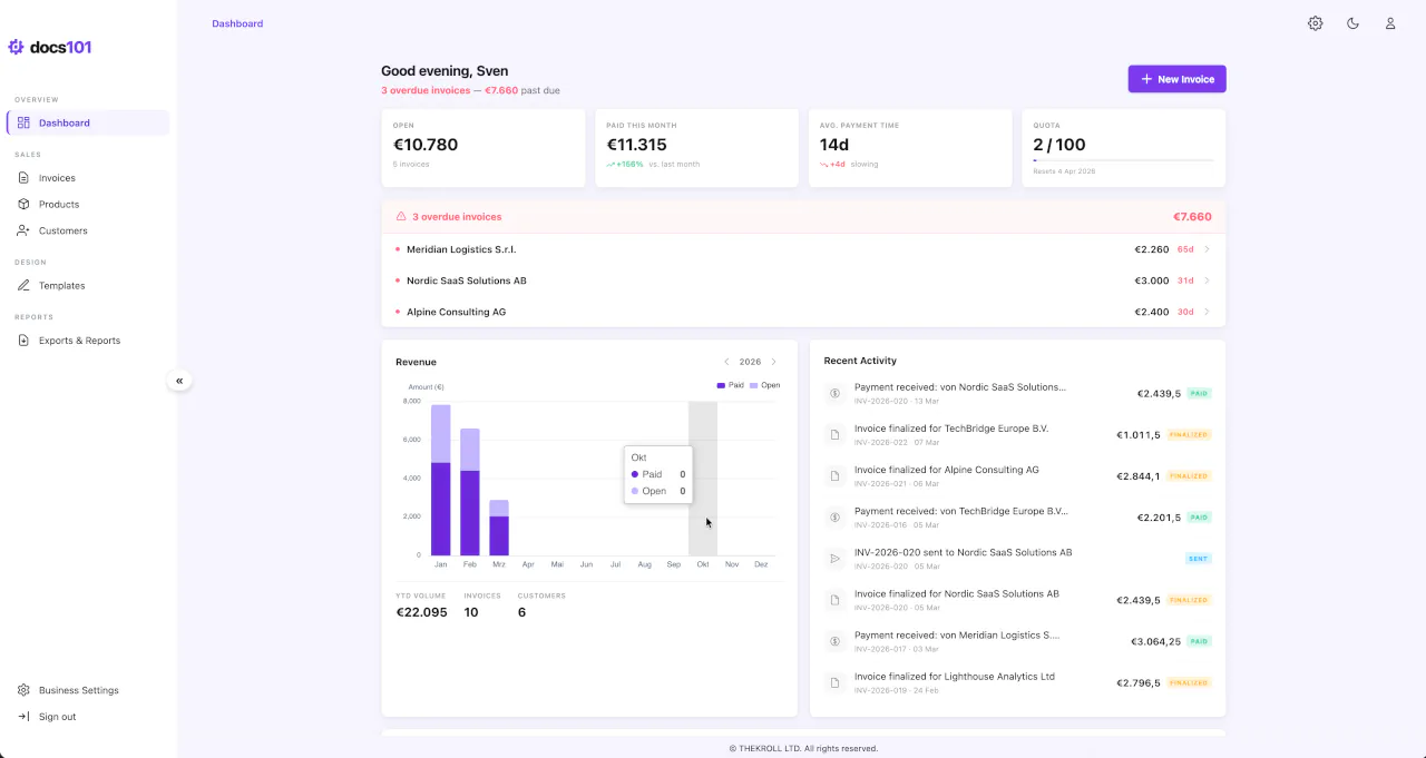
Understanding Your Dashboard
The docs101 dashboard is the first screen you see after logging in. It adapts automatically to your account state — new users see an onboarding checklist, while established users see KPIs, revenue charts, and an activity feed. Widgets appear and disappear based on your data, so the dashboard always shows what's most relevant to you.
Dashboard Layout Overview
From top to bottom, the dashboard can display the following widgets:
- Greeting Bar — Personalized greeting with a contextual summary of your most important metric
- Quota Warning — Banner when you're approaching your monthly invoice limit (Free plan)
- Onboarding Widget — Step-by-step setup guide for new accounts (disappears after completion)
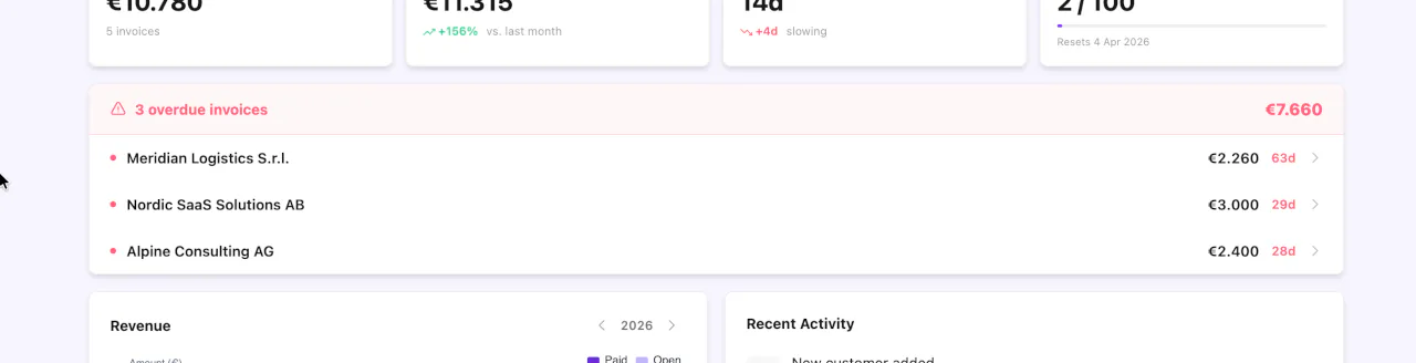
- KPI Cards — Four key metrics: Open, Paid this month, Avg. payment time, and Quota
- Overdue Attention / All Clear — Red alert card for overdue invoices, or green confirmation when all payments are up to date
- Revenue Chart + Activity Feed — Monthly revenue bars and a chronological event feed, side by side
- Quick Links — Contextual shortcuts to common actions
The dashboard is fully adaptive. Widgets appear based on your account state — you don't need to configure anything.
Greeting Bar
The greeting bar sits at the top of the dashboard and shows a time-based greeting (Good morning / Good afternoon / Good evening) with your first name.
Below the greeting, a context sentence highlights the single most important piece of information, following this priority:
- Overdue invoices — "{count} overdue invoices — {amount} past due" (red accent)
- Open invoices — "You have {count} open invoices totaling {amount}"
- Paid this month — "{amount} received this month — keep it up."
- Fallback — "All caught up. Ready to create your next invoice?"
The right side shows a primary action button:
- Complete Setup — for new users with an incomplete account setup (opens the Setup Assistant)
- New Invoice — for established users (disabled when quota is exhausted)
- New Customer — appears as a secondary button when you have fewer than 5 customers
KPI Cards
The dashboard displays four KPI cards, each with a current value, trend indicator, and meta text.
Open
Shows the total amount of your unpaid invoices (status Open or Sent). The trend arrow compares to the previous month — an increase (↑) appears in red, a decrease (↓) in green. If you have overdue invoices, the meta text shows the overdue count in red.
Paid This Month
Shows the total amount received in the current calendar month. The trend shows the percentage change compared to the previous month (e.g., +23%). The meta text shows the comparison month name.
Avg. Payment Time
Shows the average number of days from invoice send to payment. A negative trend (fewer days = faster payments) appears in green with "improving." A positive trend (more days = slower payments) appears in red with "slowing."
Quota
Shows your current invoice usage against your plan limit (e.g., 7 / 100). A progress bar visualizes your usage. When usage reaches 66% or higher on the Free plan, an Upgrade link appears.
Trends only appear for the current year and when previous month data exists. If you see dashes (—) instead of values, you either have no invoices yet or are viewing a past year.
Overdue Attention
When you have invoices past their due date, a red attention card appears showing the total count and amount. Each overdue invoice is listed as a clickable row with the customer name, amount, and days overdue. Clicking a row takes you to the invoice detail page where you can send a reminder, verify details, or mark the invoice as paid.
When no invoices are overdue (and you have at least one invoice), a compact green All Clear card confirms that all payments are up to date.
An invoice is overdue when its due date has passed and its status is still Open or Sent.
Revenue Chart
The revenue chart displays monthly data as stacked bars — Paid (green) and Open (blue) amounts per month. The chart has a fixed height of 280px and shares its row with the activity feed.
YTD Summary Strip
Below the chart, a summary strip shows three year-to-date metrics:
- Volume — Total invoiced amount for the year
- Invoices — Total invoice count for the year
- Customers — Number of active customers
Year Navigation
Use the year picker in the chart header to navigate between years and compare performance across different periods.
The revenue chart appears once you have at least 3 invoices. Below that threshold, a placeholder message is shown instead.
Activity Feed
The activity feed shows a chronological list of recent business events from your audit log. Each entry includes an icon, a human-readable description, a relative timestamp, and — for invoice events — the amount and status badge.
Event Types
| Event | Description | Click Target |
|---|---|---|
| Invoice created | "Invoice {number} created for {customer}" | Invoice detail |
| Invoice sent | "Invoice {number} sent to {customer}" | Invoice detail |
| Invoice paid | "Payment received: {customer} — {number}" | Invoice detail |
| Invoice canceled | "Invoice {number} canceled" | Invoice detail |
| Customer created | "New customer: {name}" | Customer detail |
| User invited | "{user} invited {email}" | Settings > Team |
When a team member performs an action, their name is included in the description. Actions you performed yourself omit the attribution.
If no activity has been recorded yet, the feed shows an empty state with a prompt to create your first invoice.
Auto-fill Banner
When steps 1–3 of your account setup are still incomplete, a gradient banner appears above the onboarding widget prompting you to use the Setup Assistant.
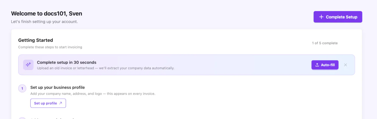
The banner reads "Complete setup in 30 seconds" and opens the Setup Assistant modal when clicked. It offers a faster alternative to filling in your company profile, tax details, and bank account manually — just upload a business document and the assistant extracts the data for you.
The banner becomes compact (single line) when only one of the three steps remains incomplete. It disappears entirely once steps 1–3 are all complete, or when you dismiss it.
Onboarding Widget
New users see a Getting Started widget that guides them through five setup steps. A progress ring shows how many steps are complete.
Setup Steps
| # | Step | What to Do |
|---|---|---|
| 1 | Set up your business profile | Add your company name, address, and logo |
| 2 | Add your tax information | Enter your VAT ID or tax number |
| 3 | Add a bank account | Add payment details that appear on invoices |
| 4 | Add your first customer | Create a customer with billing address and contact details |
| 5 | Create your first invoice | Choose a template, add line items, and preview |
Steps 1–3 can be completed automatically using the Setup Assistant by uploading a single business document.
Completed steps show a green checkmark. The first incomplete step shows an active CTA button. The widget disappears permanently once all five steps are done.
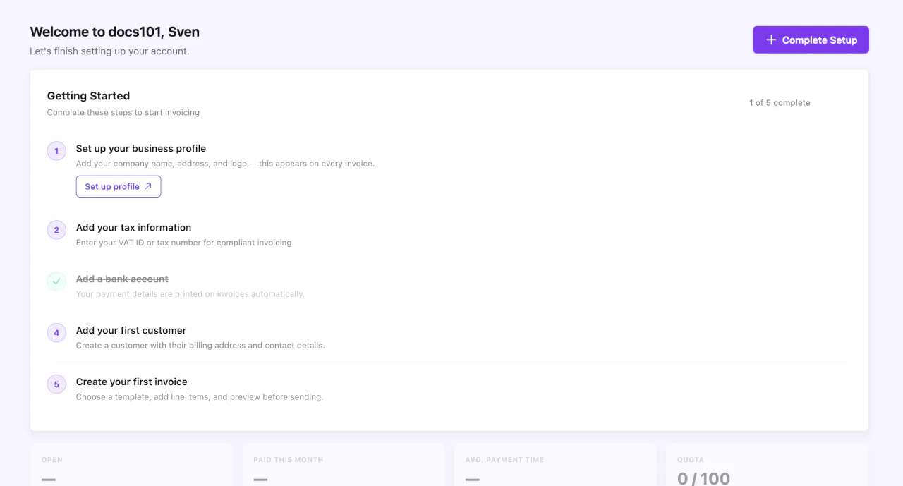
You can complete steps in any order, but the suggested sequence is optimized for getting your first invoice out quickly.
Quick Links
After completing your account setup, the onboarding widget is replaced by Quick Links — up to three contextual shortcuts to common actions like choosing a template, importing customers, or connecting Clockify.
Some links may show a "Coming soon" badge for features that are not yet available. Quick links are only visible after setup is complete.
Quota Warning Banner
If you're on the Free plan and approaching your monthly invoice limit, a warning banner appears above the KPI cards:
- Yellow at 80% usage — reminds you of the remaining quota and reset date
- Red at 100% usage — indicates the limit is reached with a prompt to upgrade
When you reach 100% of your quota, the New Invoice button is disabled until your quota resets at the start of your next billing cycle. Upgrade to Pro for 100 invoices per month.
Dashboard Best Practices
Daily: Read the greeting bar context sentence and check the overdue attention card for invoices that need follow-up.
Weekly: Review KPI trend arrows to spot changes in payment speed or open amounts. Scan the activity feed for team actions.
Monthly: Analyze the revenue chart for seasonal patterns. Use the year picker to compare year-over-year performance.
Troubleshooting
KPIs show dashes instead of values?
You either have no invoices yet, or you're viewing a past year with no data. Switch back to the current year using the chart's year picker.
No chart visible?
The revenue chart requires at least 3 invoices to display. Create a few more invoices and the chart will appear automatically.
Onboarding widget still showing?
Check which setup step is still incomplete — look for the step without a green checkmark. Complete it to progress. The widget disappears only after all five steps are done.
Quota warning won't go away?
The warning stays visible until your quota resets (shown on the banner) or you upgrade to Pro. Visit Settings > Subscription to manage your plan.
Next Steps
- Create your first invoice — Step-by-step invoicing guide
- Manage your customers — Add and organize customer records
- Choose a template — Pick and customize your invoice design